Hero image audit
Build the image that wins the click
Upload a listing image and get the specific changes that make it stronger — every weak point and strong point, scored, explained, and paired with the exact fix. No checklists. No platitudes.
Credits from $1.20 each · No subscription · Nothing to cancel
The problem
Judged in one second, at 160 pixels wide
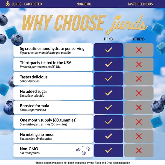
That's the size of a search result thumbnail. Most sellers design at 2000px and never check what survives the shrink — the 12pt benefit text, the thin stroke on a claim badge, the pale grey subhead. It all disappears, and the click goes to a competitor whose image reads instantly.
Categories scored on every single image
Listings compared head to head in one pass
Lowest cost per analysis, at volume
Marketplace compliance
White-background and text rules that can suppress a listing
Keyword & text placement
Whether your benefits land where the eye actually goes
Font legibility
Does your copy survive at 160px in search results
Render & image quality
Lighting, shadows, sharpness, amateur tells
Product prominence
How much of the frame your product actually fills
Contrast & colour
Text-to-background contrast and palette harmony
Clutter & hierarchy
One clear focal point, or six competing ones
Emotional appeal
Whether the benefit reads in the first second
Differentiation
Distinct from the category, or a stock template
How it works
Three steps. Two minutes.
Bring your main image
The hero image is the one that wins or loses the click in the search row, so it is the one this grades — held to the marketplace's policy rules, with compliance failures flagged separately from conversion.
Upload your image
Drop in a JPG, PNG or WebP up to 25MB. Large renders are handled automatically, so a 4000px master file is fine.
Watch the audit build
Nine categories scored and written live, each with the specific problem, why it costs you conversions, and exactly what to change.
Pricing
Buy credits. No subscription.
See all packsTrial
Audit one listing end to end
- 10 analyses — one listing audited end to end
- Single-image audit (1 credit) or five-way comparison (4)
- Optional deep audit for 2 credits when an image matters more
- Nine scored categories, each with a named fix
- Marketplace policy-compliance flags
- Download any report as a PDF
Brand
A full catalogue pass
- 17% cheaper per analysis than Trial
- Everything in Trial
- Room to audit ten products, then re-run after the fixes
- Every report kept in your account
Studio
For agencies running client work
- 27% cheaper per analysis than Trial
- Everything in Brand
- Client-scale volume: ~30 products with before/after runs
- Unused credits roll into the next project
Agency
Multi-brand, at the lowest unit price
- 37% cheaper per analysis than Trial — the lowest offered
- Everything in Studio
- Sized for multi-brand catalogues and retainers
- Request a custom render from the team — 250 credits, two revisions included, back within a week
Network
Standing capacity for a full roster
- 42% cheaper per analysis than Trial
- Everything in Agency
- Enough to audit a roster and re-run every fix
Enterprise
In-house teams and large catalogues
- 50% cheaper per analysis than Trial — the lowest offered
- Everything in Network
- Catalogue-scale volume with before and after runs throughout
Prices are in US dollars. In the UK, Ireland and Australia checkout shows the equivalent in your own currency — that is the amount you are charged. Paddle is our reseller and collects any VAT or sales tax due, shown before you confirm.
Credits never expire and there is nothing to cancel. Buy what a project needs, come back when the next one starts.
About us
Design people, not a dashboard
ONEH3RO comes out of a design studio that builds listing imagery for a living — packaging, product renders, A+ modules, the lot. It exists to hand founders and designers the read on a category that normally takes years inside the packaging industry to develop: what actually works on a crowded shelf, and why.
What we do
Score a listing image the way the category leaders' images would score, then name the specific change — this claim is illegible at thumbnail size, this render reads as amateur, this frame is 60% empty.
Why we do it
A search result gets a fraction of a second, on a phone as often as a desktop or a tablet. Your image has to stop a thumb mid-scroll and earn the tap before anyone reads a word of your brand story. Good products lose to worse products that got that one moment right.
What it saves
The catch happens before the print run, not after. Changing a benefit callout in the file costs an afternoon; changing it once the packaging is printed and the listing is live costs a reprint and a month of traffic.
Where the rubric comes from
Years of packaging work, written down
I spent years as a packaging designer inside a multi-million-pound beauty and supplement business — renders, mock-ups, packaging artwork and listing imagery, day in and day out. The job was never to make a nice picture. It was to make the picture that beat the one sitting next to it in the search row.
That teaches you things a brief never mentions. Which benefit earns the top-left. How many claims a frame holds before none of them land. Where text can sit before it fights the product. Whether a prop adds context or steals the eye. What a colour does at 160 pixels that it never does at 2000. You learn it by shipping, by testing against the biggest brands in the category, and by being wrong often enough to stop guessing.
The hardest part is that designers and customers are not looking at the same thing. We want it to look good — considered type, a clean render, a composition worth putting in a portfolio. A shopper wants to know what it is and why it beats the one beside it, in about a second, at the size of a stamp. Those two goals overlap far less than anyone in a studio likes to admit, and where they part company the shopper always wins.
Across that work, the images I designed won their head-to-head tests against competing listings roughly 60–70% of the time.
ONEH3RO is that judgement written down. The nine categories are the same nine things I check by eye — hierarchy, contrast and colour, text legibility at thumbnail size, render quality, product prominence — turned into a rubric a model applies the same way every time, on every image, without getting tired or talking itself round.
The AI has no taste of its own. It has my checklist, and it runs it in two minutes instead of an afternoon.
Who it's for
Anyone whose product is judged on a photograph
Designers & studios
Bring a second opinion to a client review that is otherwise one person's taste against another's. The rubric is the same every time, so the argument moves off opinion.
Supplement & wellness brands
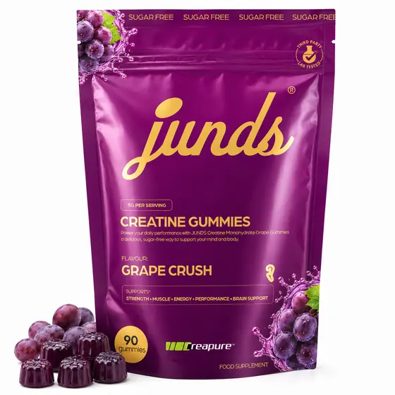
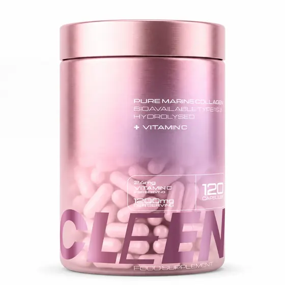
The most crowded shelf on the marketplace, where every rival runs the same pouch on the same white background and the win is in legibility and claim hierarchy.
Founders & small teams
No in-house designer and no budget for a full creative audit. Get the notes a studio would give you, on the image you already have.
Every other niche
Homeware, tools, pet, beauty, food, apparel. The nine categories are about how an image reads at 160 pixels, which is not a property of the product inside it.
The category on the label matters less than the moment: you have artwork, you are about to commit money to it, and you want to know what a stranger sees in the first second. That is the same question whether you sell creatine, candles or cabinetry.
No signup needed to look
Start with your best image
About two minutes, you keep the report, and the first one is free.