A real report · no signup
This is the actual output
Five flavour variants of one creatine gummy brand, scored in a single pass — the question every multi-variant seller has, which bag wins the row when all five sit side by side. Nothing below is written for marketing: it is the unedited report, exactly as a customer receives it. The bag under audit placed first of five, at 84 out of 100 — and the report still marks 4 things on it to fix.
Sample comparison — five flavour variants
Public sample report
The winner
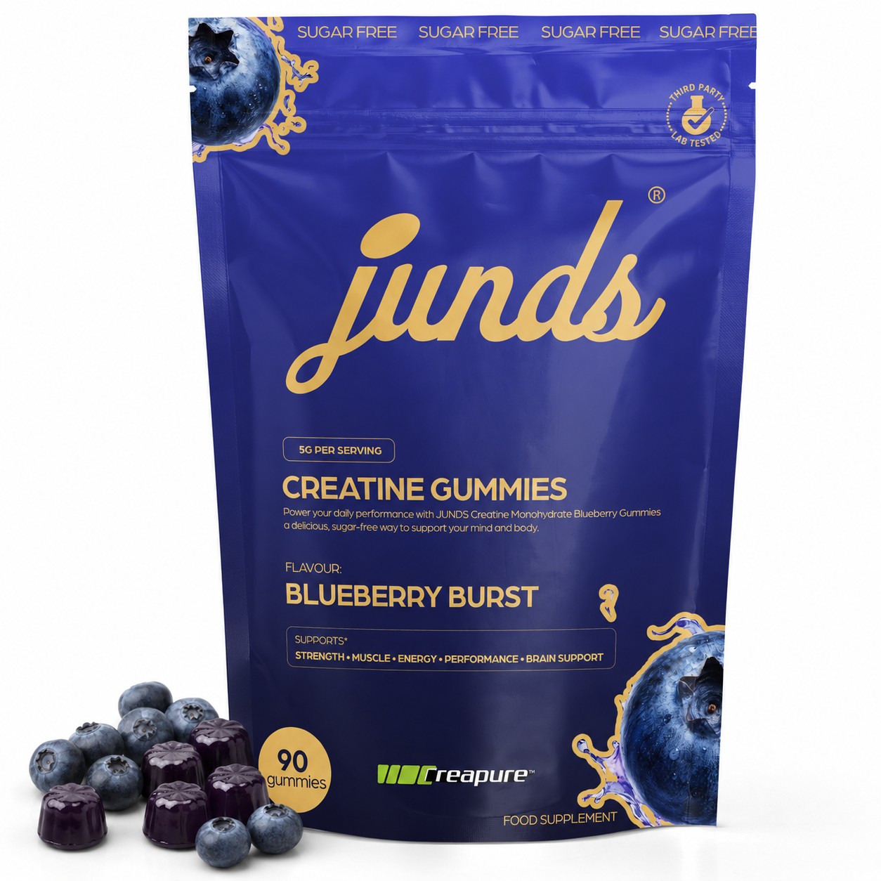
Blueberry Burst — audited
Your navy blueberry bag wins the row on raw stopping power — it is the only dark pack against the marketplace's white grid and has the most photoreal fruit — but Competitor 4 (Lemon) beats you outright on text legibility at thumbnail size, and your near-black gummies plus fruit-heavy prop pile are what you need to fix to hold that lead.
The audited bag wins
6 points clear of Lemon Zing
Standings
Open one for the detail
1stBlueberry BurstAudited84/100
Strongest
Highest contrast silhouette against white plus the most photoreal fruit render — you are the pack the eye lands on first in a five-across row.
Weakest
Your actual product — the gummies — is the least visible thing in the frame; the dark plum colour swallows their shape and the loose blueberries outnumber them.
Deep navy against the white search background gives you the biggest luminance break in the set, and the gold wordmark reads as premium rather than as another bright candy bag. The blueberry render with the splash treatment is the most convincing fruit art of the five, and the pack fills the frame well. What holds you back is the bottom third: near-black gummies that read as lumps, ten whole blueberries crowding out the product, and a second oversized blueberry graphic competing with the Creapure lockup.
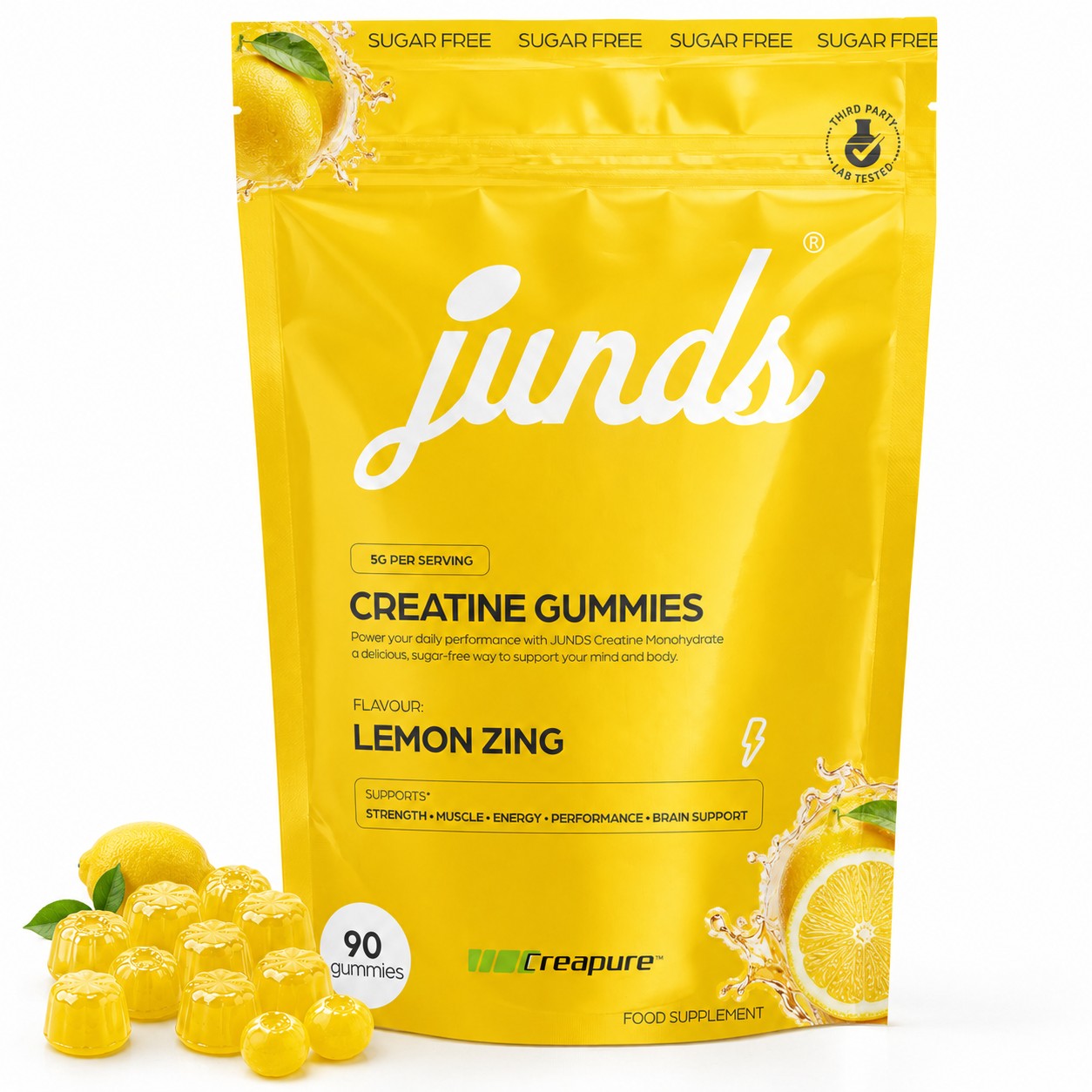
2ndLemon Zing78/100
Strongest
Black-on-yellow typography — the only pack whose claims and flavour name genuinely survive thumbnail scale.
Weakest
Yellow bag on a white background loses its silhouette, and the white logo half-disappears into the pack.
The most legible image in the set by a wide margin — black type on yellow makes CREATINE GUMMIES, LEMON ZING and the SUPPORTS strip readable at a size where every other pack here is mush, and the yellow gummies plus lemon slice are unmistakably candy. It loses to you on two counts: yellow has the least separation from the marketplace's white background, so the pack edge softens in the grid, and the white 'junds' wordmark on yellow is the weakest brand read of the five. The description line is also truncated — it says 'Creatine Monohydrate' with no flavour word.
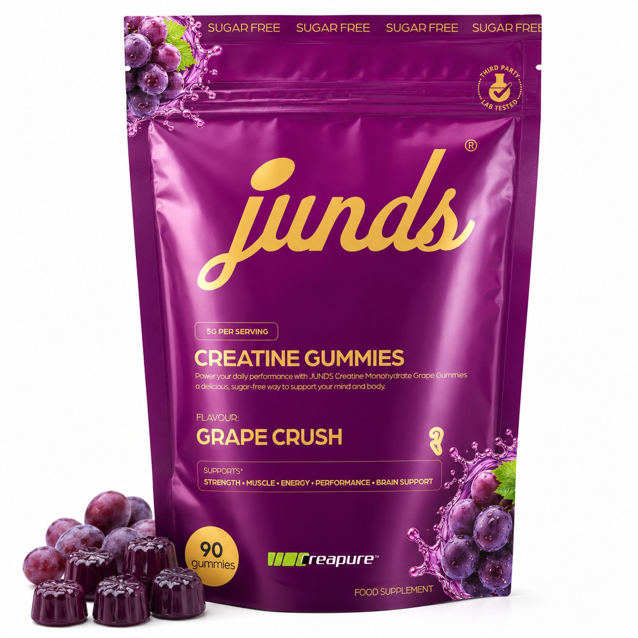
3rdGrape Crush71/100
Strongest
Saturated magenta is genuinely eye-catching against white and the grape render is glossy and appetising.
Weakest
Gold-on-magenta type has the second-lowest legibility in the set, and the purple gummies disappear into the purple grapes.
The magenta-purple grape bag is vivid and the grape cluster render is clean, but gold type on magenta is a much softer contrast pairing than your gold on navy, so the flavour name and body copy fade earlier as the thumbnail shrinks. Its prop pile has the same problem as yours — grapes and dark gummies are nearly the same tone, so the two merge into one purple mass at the bottom-left.
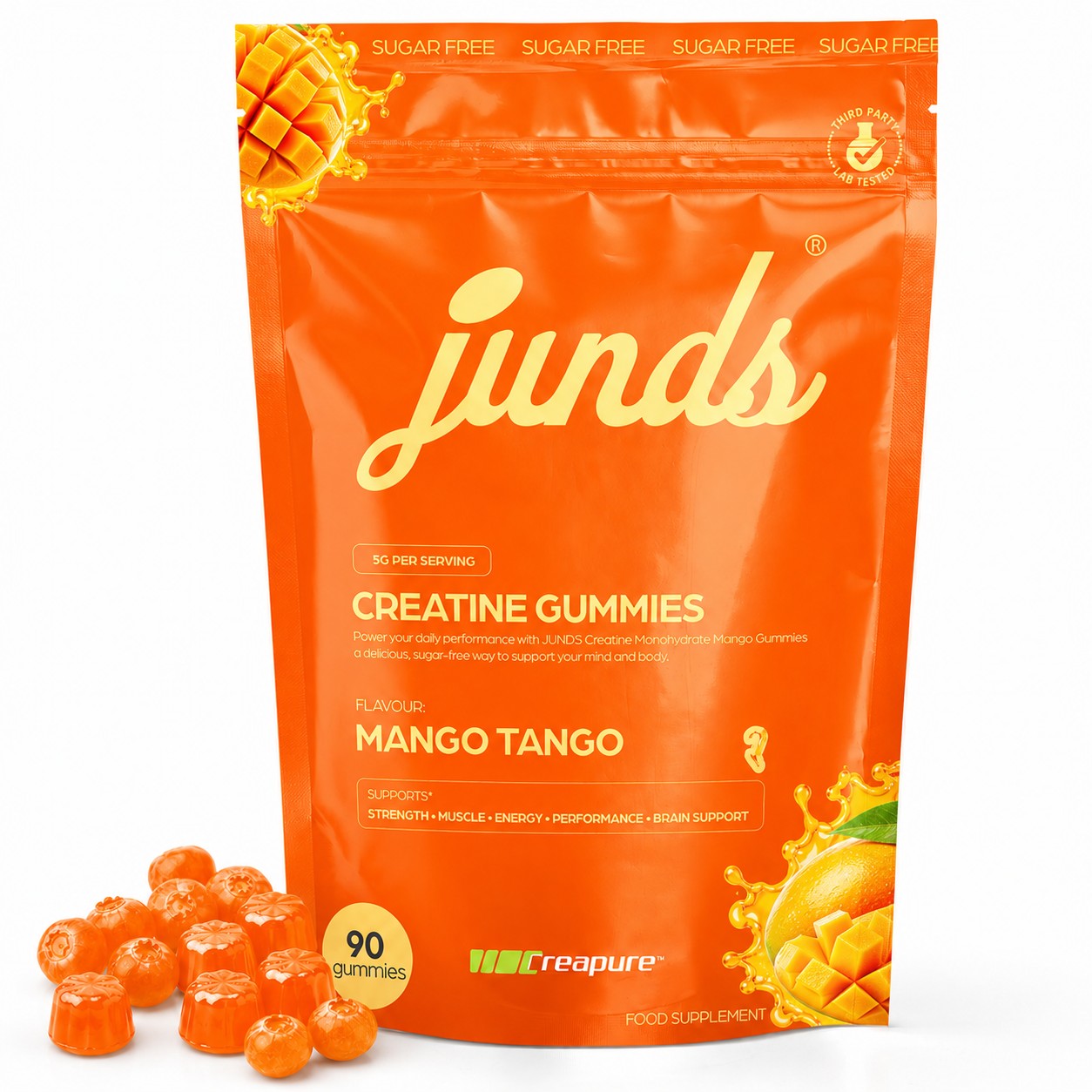
4thMango Tango68/100
Strongest
Orange is a high-arousal colour that competes well for attention against your navy.
Weakest
Pale-on-orange type and orange-on-orange gummies mean neither the words nor the product separate from the bag.
Strong warm orange that pops in the row, and the mango render with the cubed flesh is appetising. But the pale-yellow type on orange is low contrast, the orange gummies are the same hue as the bag so the prop cluster reads as an extension of the packaging rather than as product, and the gummies are again blueberry-shaped in an orange colourway, which looks recoloured rather than photographed.
5thGreen Apple Burst52/100
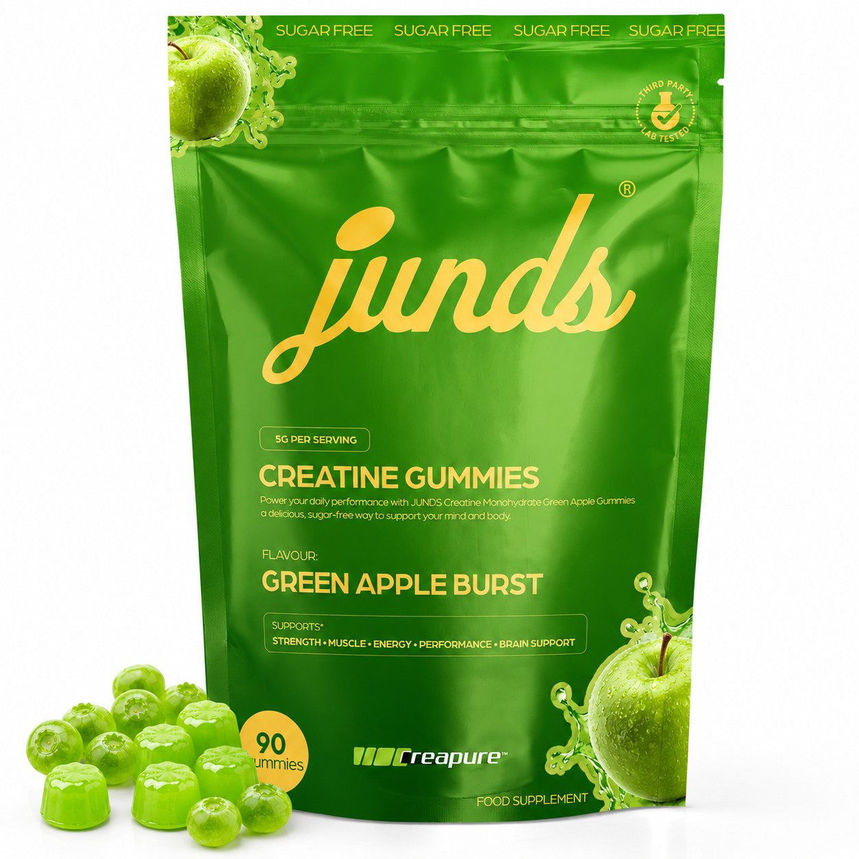
Strongest
Bright green is a distinct hue in the row and the apple render itself is sharp.
Weakest
Gold text on green is close to illegible, and blueberry-shaped green gummies undercut the flavour story and look retouched.
The weakest of the five. Yellow-gold type on a mid-green field is the lowest-contrast text pairing here — the paragraph, the 5G pill and the SUPPORTS strip all vanish at thumbnail. Worse, the loose gummies are green blueberry shapes next to a green apple, which reads as a colour swap rather than a real product shot, and the green gummies barely separate from the green bag behind them.
Where you lose ground
Each category scored 0–10, sorted by how far the audited bag sits behind the best image in that row. Close the top few and the ranking moves.
Show every score
| Category | Blueberry Burst | Grape Crush | Green Apple Burst | Lemon Zing | Mango Tango |
|---|---|---|---|---|---|
| Marketplace complianceJudged only on the conversion cost of clutter and props: all five stack on-pack banners, a lab seal, a count badge and loose fruit. Yours carries the most graphic elements (two large berry renders plus splash plus boxed claims strip), while Lemon keeps its lower panel cleanest. | 5/10 | 5/10 | 5/10 | 7/10 | 6/10 |
| Keyword & text placementYou place '5G PER SERVING', 'CREATINE GUMMIES', flavour and '90 gummies' in a clean top-to-bottom ladder and your description names the flavour in full; Lemon matches the ladder but its description line is truncated with no flavour word. | 8/10 | 7/10 | 6/10 | 8/10 | 7/10 |
| Font legibility at thumbnailBlack on yellow (Lemon) is untouchable here. Your gold on navy is the best of the tonal-gold packs, but it still loses the paragraph and the SUPPORTS strip at small size. Green Apple's gold on green is the worst read in the row. | 7/10 | 6/10 | 3/10 | 9/10 | 5/10 |
| Render & image qualityYour blueberry with water beading and splash is the most convincing fruit render of the five; Green Apple and Mango are dragged down by gummies that are clearly blueberry moulds recoloured to match the flavour. | 9/10 | 8/10 | 6/10 | 8/10 | 7/10 |
| Product prominenceYour bag is the largest, darkest mass in the frame and holds the most space. Green Apple loses points because its green gummies sit against a green bag, and Mango's orange gummies against orange do the same. | 9/10 | 8/10 | 7/10 | 8/10 | 8/10 |
| Contrast & colourNavy against marketplace white is the biggest tonal break available in this row; yellow (Lemon) is the smallest. Green Apple is penalised twice — low internal text contrast and low separation between props and pack. | 9/10 | 7/10 | 4/10 | 7/10 | 7/10 |
| Clutter & hierarchyLemon's lower half breathes; yours is the busiest bottom third in the set with a big berry graphic, the Creapure lockup, the boxed claims strip and the count badge all inside one band. | 6/10 | 6/10 | 7/10 | 8/10 | 7/10 |
| Emotional appeal & value propNavy-and-gold reads premium and supplement-grade rather than confectionery, and blueberry is the most credible 'healthy' flavour cue in the row — that combination carries more perceived value than the four bright candy packs. | 8/10 | 7/10 | 6/10 | 7/10 | 7/10 |
| DifferentiationYou are the only dark pack in a row of four saturated brights, which is the single strongest differentiator available here; Grape, Green Apple and Mango all read as variations on the same loud template. | 9/10 | 6/10 | 5/10 | 7/10 | 7/10 |
What this category does
Patterns shared by most of this set. These are conventions, not faults — none of them is why the audited bag places where it does.
Universal here, so it costs you nothing and buys a free claim in the top band — keep it.
Blueberry Burst · Grape Crush · Green Apple Burst · Lemon Zing · Mango Tango
A category convention that signals trust in supplements — worth keeping, but worth setting at higher contrast than the pack colour so it is not decorative only.
Blueberry Burst · Grape Crush · Green Apple Burst · Lemon Zing · Mango Tango
Everyone does it, so removing your props would make you look less appetising than the row — keep the props but change the fruit-to-gummy ratio.
Blueberry Burst · Grape Crush · Green Apple Burst · Lemon Zing · Mango Tango
Shared spec shorthand that answers the two buying questions instantly — keep all three and simply enlarge the count roundel.
Blueberry Burst · Grape Crush · Green Apple Burst · Lemon Zing · Mango Tango
A convention worth breaking — Lemon's black-on-yellow proves that dropping the tonal palette for one high-contrast text colour is the single biggest legibility win available in this row.
Blueberry Burst · Grape Crush · Green Apple Burst · Mango Tango
Policy risk
lowSeparate from the score above, and deliberately so. This is about whether the marketplace could suppress the listing — not about whether a shopper clicks it. Breaking a rule the whole category breaks is a business decision, not a design defect.
All 5 images in this set place loose fruit and gummies outside the pack on the white floor, and all 5 use a pure white background with no added off-pack graphics or overlay text; every badge and claim in your frame is printed packaging, which is permitted.
- minorThe ten loose blueberries are props that are not inside the bag, which is the only element in your main image that a strict reviewer could flag.
If you want to be compliantKeep three or four berries as an unmistakable flavour cue rather than a full handful, so the frame is dominated by the product actually sold.
Where the audited bag loses
Your gummies are so dark they read as black lumps at thumbnail — nobody can tell they are gummies, only that something dark is sitting on the white floor.
Why it costs you: Shoppers scanning creatine gummies are looking for a visible, appetising candy; Lemon's bright translucent yellow gummies instantly communicate 'gummy', while yours communicate an unidentified dark shape and force the viewer to read text to understand the format.
Fix: Relight the gummy cluster with a strong backlight or rim light so the deep purple goes translucent, add a specular highlight on each fluted top, and consider raising the colour a shade toward violet so the moulded shape survives at 200px.
Whole blueberries outnumber and out-size the gummies in your prop cluster — roughly ten berries to five gummies — so the hero object at the bottom-left is fruit, not product.
Why it costs you: Lemon shows one lemon and about nine gummies, so its prop pile advertises what is in the bag; yours advertises fruit you do not sell and dilutes the count claim sitting right beside it.
Fix: Rebuild the cluster with eight to ten gummies in front and three blueberries tucked behind as a flavour cue only, and push the front gummy row slightly forward of the bag edge for depth.
Your bottom third is the most congested band in the set — the oversized second blueberry render, its splash, the boxed SUPPORTS strip, the Creapure logo and FOOD SUPPLEMENT all fight inside one horizontal slice.
Why it costs you: At thumbnail this band collapses into visual noise, so the one line that could sell the benefits (STRENGTH • MUSCLE • ENERGY) is lost; Lemon keeps that same strip surrounded by open colour and it stays readable.
Fix: Shrink the lower-right berry by about a third, drop the outline box around the claims strip, and cut the benefit list from five items to three so the type can be set larger.
The film on your upper panel shows pronounced sheen bands and creasing across the largest area of flat navy in the frame.
Why it costs you: On a dark pack every highlight streak is visible, and at small size the reflections read as a wrinkled or handled bag rather than a premium sealed product, which softens the price you can defend.
Fix: Retouch the two brightest diagonal glare bands out of the upper navy panel and keep a single soft gradient highlight so the pack looks freshly filled and taut.
Do these first
- 01
Relight and lift the gummies so they read as translucent purple candy, not black lumps — this is the one thing Lemon does better that directly costs you clicks.
- 02
Reverse the prop ratio to roughly nine gummies to three blueberries so the pile in front of the bag advertises the product, not the fruit.
- 03
Raise the gold on the SUPPORTS strip and flavour name toward near-white, and cut the benefit list to three words, so at least one benefit line survives at thumbnail size.
- 04
Shrink the lower-right blueberry render by a third and delete the outline box around the claims strip to decongest the busiest band of your pack.
- 05
Reduce the two-line description paragraph to a single short line and give the reclaimed space to a larger '90 GUMMIES' roundel.
Generated by an AI model without human review · ONEH3RO · Independent listing-image analysis · Not affiliated with Amazon · Scores rate image design, not product quality · Rank reflects image design alone, not reviews, price or ad spend.
Now do it with yours
Your first standard audit is free, no card needed. After that, credits start at $24 for ten and never expire.
Create an accountAll five images above are Junds pouches — one brand's flavour range, published here in full because the brand and ONEH3RO share an owner. The report itself was not edited, softened or re-run: it is a single pass of the same analysis a customer pays for, which is why the bag under audit loses. Scores assess image design against the marketplace's published image policies and general conversion practice — they are not a statement about product quality.